old tv, vcr and dvd player
My home theater is not what you’d call impressive or up-to-date. In fact, the TV is more than 20 years old, I bought the stereo 10 years ago and the CD reading laser has long since burnt out (but the speakers still work) and the DVD player is made by Daewoo (you know, the same company who makes cars with a logo that looks like a pair of underpants). So, even though it’s not all that impressive, I enjoy watching movies.
I have a decent grasp of entertainment systems and knowing how things work generally, but a while ago, when we bought the underpants-logo DVD player, I ran into a problem that had me stumped. In case anyone else runs into the same issue, here’s what I learned.
The TV is the same one my in-laws used when my wife was a little girl and it’s so old it only has input for a coax cable. My VCR has audio/video RCA ports and coax ports, and the DVD player only has RCA ports. The stereo has auxiliary audio RCA ports.
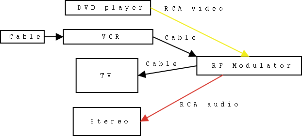
My first try was to run the DVD player through the VCR, but when I played a DVD the screen looked like someone was holding a magnet up to it every few seconds. The picture would go from great, to awful every 10 seconds or so. It wasn’t satisfactory. I later learned that this is done to keep people from recording DVDs and the only solution is to buy an RF modulator. I picked one up along with a video cable at a nearby Radio Shack for about $20.
The RF modulator now receives the DVD and VCR video outputs and then sends the signal to the TV through the coax cable. The signal from the cable provider goes into the VCR as well. My only problem now is that the RF modulator only has one audio input, so I either have to switch audio cables between the VCR and DVD player in order to get the audio through my stereo, or just leave them and use the TV when we use the VCR (which is what we do now). I could also buy an audio splitter but I’m not that concerned about it.
Here’s an article explaining the details of why you need an RF modulator and since this is a prime example of a picture being worth 1,000 words, here’s a diagram I made that illustrates my setup.
You forgot to mention that our underpants-logo DVD player has stopped working after only 1 1/2 years. Piece of junk!
True, the Playstation is now acting as our non-underpants-logo-DVD player.
I had to do the same thing with our DVD player. I was so annoyed at spending 20 bucks for a work-around for Hollywood’s collective paranoia that I ripped the movie I was trying to watch and put it on the intarweb.
Well, I would have if I wasn’t so lazy. I made do with a few mumbled epithets instead.
I did shake my fist in a westerly direction, though.
is it the ps original or the ps2? only because you mentioned everything was old.
mckay: Well at least you thought about it, and I’m sure the fist shaking towards the west felt good.
whaleman: Good question. The Playstation is a shining exception from the rest of the components. It’s not only a PS2, but the new, smaller one (almost the size of a paperback novel).
The real question is “Why even bother?” Get a new stereo and TV instead of wasting time and effort on that old crap. That’s like explaining to us how you managed to find a software workaround to get your 486 DX4 run Windows XP. Sure, it works but why even do it?
Just my two cents cousin. ;-)
BTW, I just tried to post with nothing in the E-mail field and it gave me an error saying that it is required. Your page shows it as optional though.
Rick: Why do it? Because you can (and I’m a miserly tightwad). Plus, not everyone wants to have to buy a new stereo and TV to get their DVD player and VCR to work.
Thanks for letting me know about the optional e-mail issue. That’s a result of the upgrade.
Now, i have the same sort of setup on my tv in the bedroom and i have the video going from the DVD and VCR through a single rca (the yellow) to the RF modulator and then the red and black rca connections going to the stereo. Then you just turn the tv’s volume all the way down and you can enjoy stereo sound on all components. even if you only have the triple rca cable r/w/y, you can usually split the yellow off by just pulling it like a licorice from the pack.
just my $0.02..
I have a new girl friend who asked me if I was able to hook up her dvd to her older tv, no one else could do it. So I will run out and get an RF Modulator and maybe get lucky tonight!!!! ha!ha!
Thanks (I’m glad that “you bothered” to post this!)
Glad to hear I’m bringing people together through my blog. :) Best of luck tonight.
My father has a very old floor model TV with a cable box hooked up to it. There are no cable inputs in back of the TV, just two screws for a antenna if he didn’t have a cable box. I recently bought a Panasonic vcr/dvd combo & hooked it up & the VCR works fine but he gets picture distortion when playing a DVD. Would a RF modulator solve this problem, other than the fact that he needs a new TV? Also, would it help to put in red/white/yellow cables from the cable box to the dvd/vcr combo?
GaryB: Yup, an RF modulator will do the trick.
thanks a lot dude!! i have an old tv with just a coax too, so when we got this new dvd player with only rca output, a couple of days ago, i was like what the f*&$!!?? how do i connect this damn thing?
hopefully an rf modulator will do the job!
Vick: Yup, an RF modulator is exactly what you need.
It isn’t just misers who “bother” with this kind of thing. People like Rick say “just go get” new stuff as if there were no $ or waste involved. That plastic card you throw around has real consequences, as does treating objects and income as if they were truly disposable. Those of us (disabled) on limited fixed incomes appreciate stuff like this. Anyone who cares about being responsible does. Your purchases and your garbage are important. Advertising is largely a shame-based industry. Make intelligent choices . . .
judith: There certainly is something to be said for frugality.
wow i’m only 13 and this site really helped me because i also have a really old tv and i just bougt a new dvd player and i couldn’t hook it upand my dads no good at this kind of stuff so… thank keep up the good work it is really helpful
So i have an older model TV, NO VCR, cable box, DVD and of course my RF Modulator.
Help!
I can’t the three to talk to one another. What am I doing wrong?
Katey: It’s hard to say. What do you get when you try to play a DVD?
I have an older floor model tv, RCA XL-100 since 1985. Serviced only once. and still running good w/good picture and sound. However the remote control has long met it’s demise and I haven’t found another matching remote control in 10 years. Universal remotes just don’t connect. Where or who might have a remote for the old RCA XL-100?
Ebay would probably be your best bet, or you could try posting a wanted item on freecycle.org. It might be worth trying other universal remotes. As far as I know they’re supposed to work with all TVs.
try http://www.replacementremotes.com, they have quite a variety.
Thanks for this post –this has really helped me out with my older pieces of crap –some people (?) have to live with it & make do with what they have.
yello
ta very much for this! i’m exhibiting some of my video work and wanted to show it on a real retro tv (looks so much cooler than an ugly silver/grey plastic box) – had tried dvd player thru video player to tv before and it worked! but this seems easier and more reliable. so i’m off to get me one of those rf thingys. yup.
awesome work this solves several issues ive had its like a three year running issue thanks again very laid out you should write manuals haha again good work and thanks
I do not have cable tv. I have an old (analog) tv and an old JVC vcr. I have an RF cable going from my tv to the vcr. However, when I try to watch movies, the picture won’t come in clear while I’m playing the VHS video. If I pause the movie, it’s clear, but then when I hit “play” it gets fuzzy again. Audio is great and comes through my tv but video is horrible. I thought about a splitter and I cannot for the life of me, figure out what kind of splitter to get. There’s a ton of different kinds out there. I’m missing something, but I don’t know what it is….and yes, I’m a female trying to hook something back up that hasn’t been used in 13 years. I would appreciate any kind of help I can get.
I have an rca xl 100 console tv. It has 2 screws to hook up uhf antenna and one hook up for vhf antenna. Would an rf modulator let me hook up a vcr, dvd, and satellite to my outdoor uhf antenna? I would like to know how to hook all these up. Your help would be greatly appreciated. Thank you so much for your help.
I just rearranged our TV’s and DVD players. The daewoo DVD player won’t work on our old Zenith even with a RF modulator. I tried all kinds of combinations and it won’t work. The DVD player does work on our 2 newer TV’s but it won’t even work on older model tv that has the right kind of av jacks. I’m not sure what’s left to try? Any suggestions anyone?
i found out the problem, i needed to buy a newer rf modulator. for some reason the old one would work with that dvd player.
What if I don’t have a cable box? I have to connect the vcr/dvd combo to an older tv set! Before this, there was a vcr here and only two wires leading from it to the tv! Wish I was more techy!
Thank you so much for the post. I don’t know anything about electronics. I purchased an old tv and a dvd/vcr player from goodwill. I made sure both of them worked before i left the store. I had to buy a s video cord thingy, the rca outlets of course and two cable cords. Then I went and got a convertor box. I thought I was pretty smart for doing it myself. I hooked everything up and the stupid tv was fuzzy. So of course I too was like what the f*&$!! how do you hook this thing up. I looked up your post. when I saw the diagram you drew I realized I made a stupid mistake. I put the to tv cord in the dvd player instead of the tv. Wow. Maybe it’s cause i’m a girl.
@Jessica Don’t beat yourself up over it, we all make mistakes. I’m glad the diagram helped you out.
I have an older tv & vhs player I use in basement foe exercise tapes. I have a newer dvd player which I have tried to hook up.vhs seems to be puling from antenna connection. There aren’t any coaxconnections on vhs or tv. Have tryed to hook dvd to vhs but haven’t had any luck. Hate to go buy a tv.
Feel like an idiot, got so many cabels from years of collecting. Though I could just plug red/white cabels from vhs to dvd?